
GreatSchools
Improving the school search experience
Platform
Desktop, Web
Skills
Research, Product Design, Interactive Prototyping
Timeline
2.5 weeks
My Role
Researcher, Strategist, Product Designer
GreatSchools' mission is to continually provide parents with the information needed to unlock the best opportunities for their children. Revamping the school search would help more families easily tap into its wealth of knowledge and prepare for a successful future.
Overview
GreatSchools is a leading national nonprofit that empowers parents to unlock the best educational opportunities for their children. They provide easy-to-understand information like ratings and outcomes on K-12 schools so parents can find the right fit for their family.
Challenge
GreatSchools' goal was to improve the school search experience for parents. Our team was tasked with simplifying the search experience as a whole for users.
Solution
Improve GreatSchools' school search experience by decreasing its learning curve, making its features more useful, and providing a more personalized search experience on both desktop and mobile.
While the site's search algorithm couldn't be touched (the cause for a lot of user issues), we prioritized results personalization and site consistency. Putting out the little fires could overall improve parents' search experience..
Discovery
〰️
Discovery 〰️
User Research
User interviews and surveys focused on learning how parents would interact with a search feature. We learned:
Users most often used GreatSchools because they were moving to a new neighborhood.
GreatSchools users were unhappy with their query because there was no obvious way to narrow their search results.
Users were most familiar with the search experiences on Google, Amazon, and Yelp.

The overwhelming feeling we got from our interviewed parents
“I'm already worried about sending my daughter to a new school. I don't need to be stressed by the site either.”
— Elementary School Parent
Heuristic Analysis
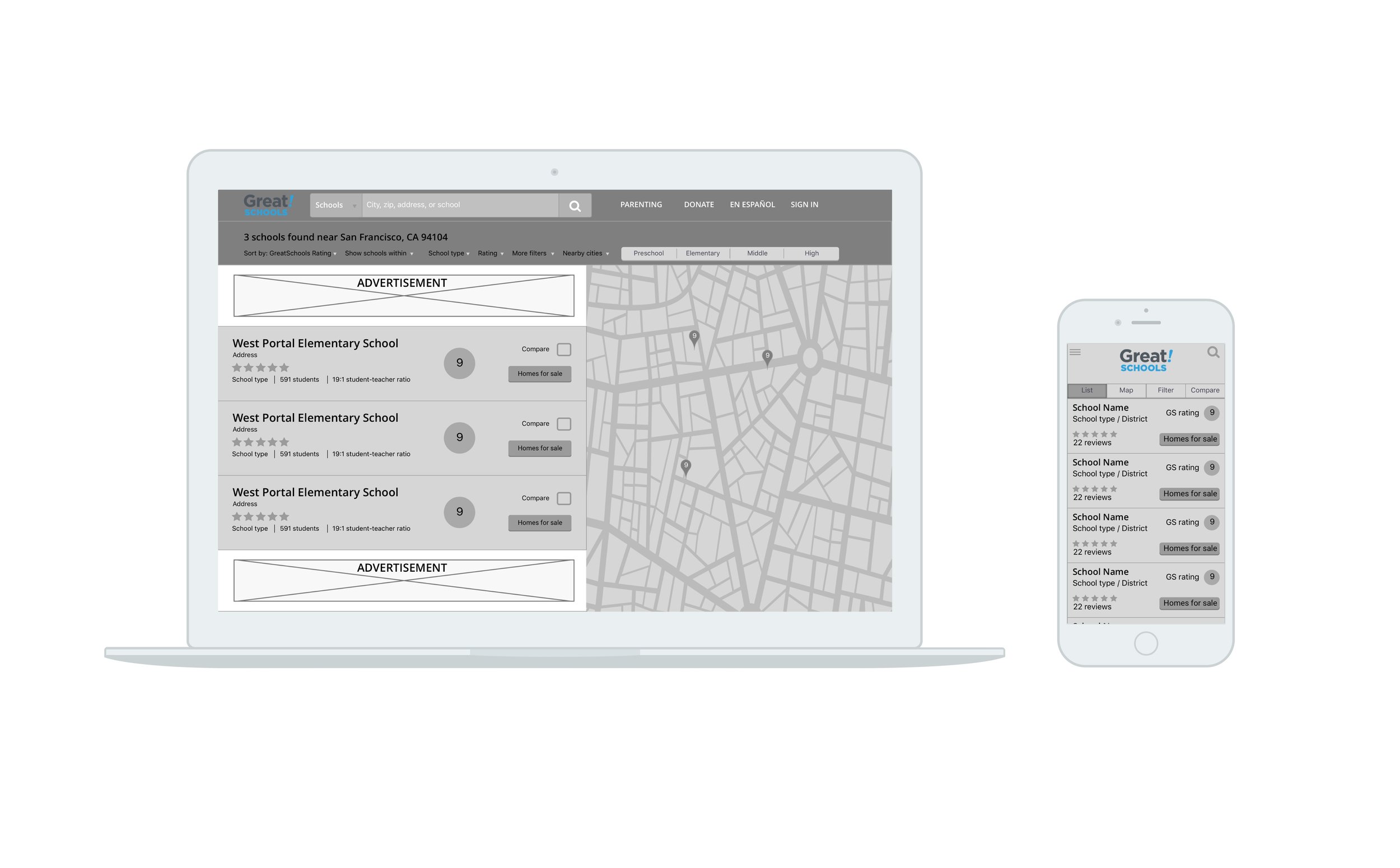
Currently, GreatSchools has many entry points to search that generate two different results pages ("core search results" and "boundary search results"). Usability tests were conducted on the web and mobile site to gain a deeper understanding of its search functionality.
Fixing GreatSchools' gaps in discoverability, consistency, and recognition would be key to improving the search experience.
Our User
Creating a user journey and empathy map helped think through and understand the process of choosing a school. Because we weren't parents ourselves, this was crucial to empathize with users and dig into their behaviors and motivations. We learned:
Fixing the dips in the Narrow, Analyze, and Compare tasks of the user journey would give users a better school search experience.
Our main persona, Linda, was driven by the desire for the best for her family. She needed relevant information to make decisions and a no-fuss way to get that.
Ideation & Design
〰️
Ideation & Design 〰️
Our Focus
Simplifying and improving a search feature was a huge monster to tackle. Our team decided to focus on Linda's goal of seeking relevant school information through easy and intuitive results personalization during this sprint.
Filtering and sorting would be the main priority.
Feature Prioritization
According to GreatSchools' analytics, only 30% of current queries used filters, with most used being Distance, Grade Level, School Type, and Rating. However, all users we tested weren't able to locate the filter menus. Yikes!
User Flow
The user flow focused on making the user's query, from input to personalization to school profile page, as simple as possible.
Test & Iterate
〰️
Test & Iterate 〰️
Testing Iterations
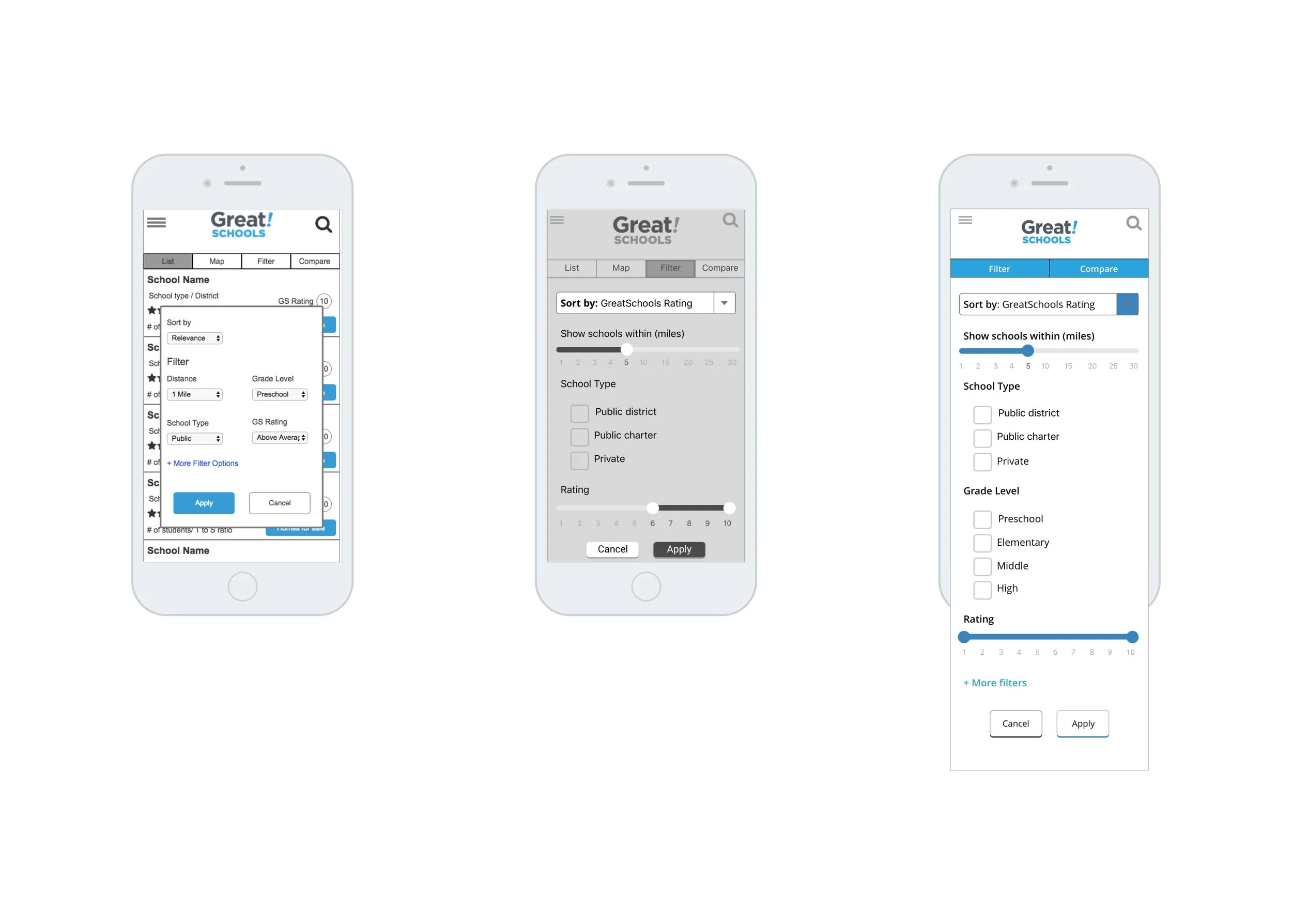
Low fidelity wireframes were created and iterated to test the functionality of the design. Annotations were made after rounds of iterating to hand off to GreatSchools engineers. A key takeaway was not to overwhelm users with information since real estate on mobile was limited. The UI would be focused on a clean, concise way to display content.
Mobile
In rounds of usability testing, users were tasked with finding local high schools and using the filter menu to personalize their results. We learned:
Users were jumping around in the filters menu → re-order the filters so they flow from one to another more intuitively
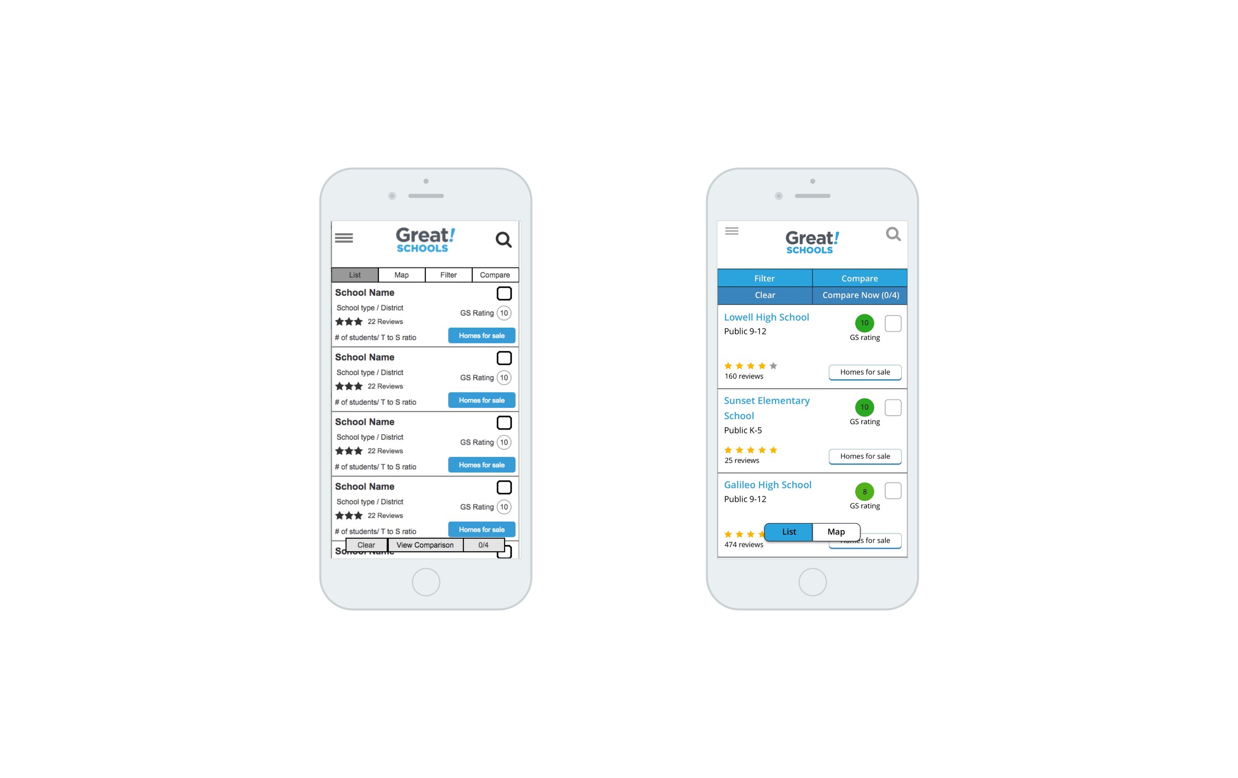
Users didn’t see the bottom sticky compare button → move it to the top
Pop-up filters menu felt clumsy to users → slide full screen menu down from the top
Tab navigation items didn’t belong with each other → Separate List and Map since they control how the results are displayed, while Filter and Compare control the actual results.
Desktop
Users were tasked with the same test on desktop. We learned:
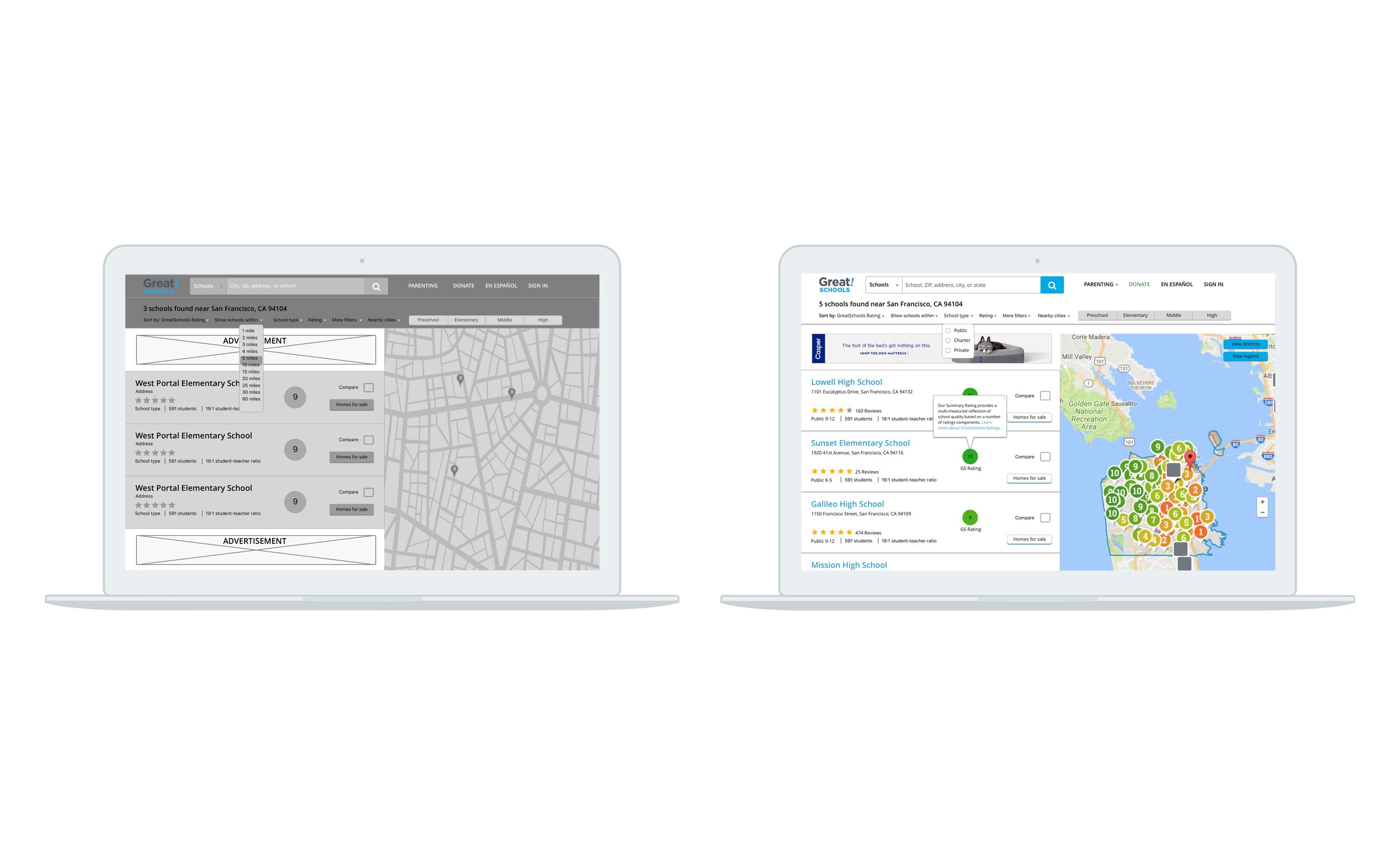
Users wanted to apply more than one option in the same filter → add checkboxes to appropriate filters
Users were confused about what the rating numbers and colors represented → add a small pop-up about GreatSchools’ rating system on hover
Build & Deliver
〰️
Build & Deliver 〰️
When making the hi-fidelity mockups, I focused on updating GreatSchools' aesthetic and cleaning up the results page so as not to overwhelm users with information. Our solution focused on giving our parents control over their search results as easily as possible. By making filtering and sorting more intuitive, parents could access the right information they need, when they need it.
Looking Back
Working with my first client made this project equally satisfying and challenging. Learning to balance client requests and users needs helped improve my client management skills and practice effective communication. I'm eager for GreatSchools to ship the new designs in the coming weeks and recommend the site to my brother who's looking for preschools for my nephew!
